
When it comes to security operations, speed and ease-of-use are critical for making the best decisions and judgments quickly. It’s important that analysts see what they need to see, and can get to the information they need as intuitively as possible. That’s why we’re excited to announce upgrades to the navigation within our security operations platform, Expel Workbench™.
Our offerings and capabilities have evolved as the security needs of our customers have grown, so we redesigned the navigation to make it even easier for our clients to manage security operations. The new design makes navigation within Workbench even more flexible, easy-to-use, and downright good looking. And the kicker is that these changes were all driven by you—our customers.
Let’s take a look at what’s new.
Sidebar navigation
The most noticeable change is that we shifted the horizontal navigation to the sidebar. This gives us more room for the essential tools we offer today and the capabilities we plan to build in the future, and makes it easier for you to get to the tools you need, fast.
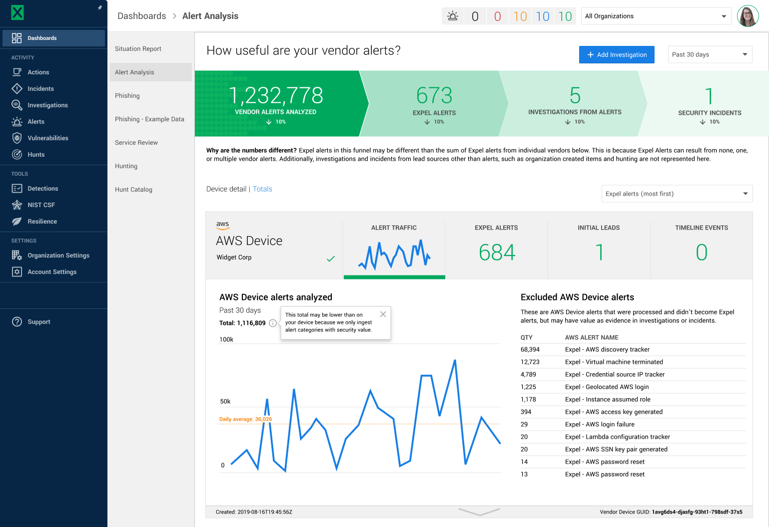
Alert ticker
You’ll also notice we’ve moved the alert ticker to the top of the interface, which makes it easier to see the most essential information first. The alert ticker links directly to all critical, high, medium, low, and tuning alerts, and is ever-present throughout Workbench for easy access.
Custom detection rules
We moved the Custom Detection Rules view from our Settings page to our Detections page. This improvement helps you better understand what will raise Expel alerts in your environment, in addition to any custom lookout, add-to investigation, and noisy alert suppressions created.
New location for Actions
One of the most important questions our customers ask when working with Expel’s security operations center (SOC) during an investigation or incident is, “What’s on our team’s plate?” We’ve made it simple to get to that to-do list by moving our Actions page to the top of our information architecture in the navigation. With one click, you now see all outstanding to-do items for the team, Expel’s SOC, or our bots, for any investigation or incident.
Breadcrumbs
Sometimes you go down a rabbit hole, checking out all the awesome work done during an investigation or incident—we get it. We’ve introduced breadcrumbs at the top of each page to make it simple to jump back to the starting point of your journey through Workbench.
Why we made these changes
We continuously ask ourselves: how can we make our users’ jobs easier and their experience in the product more intuitive? We spoke to customers, collected feedback and discovered new ways to simplify how clients use the product today and provide flexibility for how the product will expand in the future.
Our mission with the new navigation design therefore centered around four goals:
- Use navigation space more efficiently and provide room to grow.
- Create a high-level information architecture that makes even more sense.
- Reduce clicks to the important and frequently used parts of the platform.
- Align Workbench with the brand palette and iconography.
Since we launched, we’ve scaled Workbench significantly to keep up with ever-evolving security needs. We’ve added half a dozen dashboards; entire new offerings like threat hunting, phishing, and managed detection and response (MDR) support for Kubernetes; and tools like context, configurable notifications, and the NIST CSF.
The original horizontal navigation could no longer expand to accommodate existing features, never mind the accelerating pace of enhancements and new offerings we knew were coming soon. We wanted to make ground-breaking features like the detections strategy UI and additional offerings like hunting easier to find and use.
When customers have a consistently good experience across touchpoints, that creates a sense of assurance and trust—which is especially critical in security, when customers are trusting us to keep their organization safe. That’s why the colors and icons you see on the website now carry through to our Workbench platform.
How this helps you
We hope that the new navigation makes your work easier and faster. We know that this is an essential tool you use every day—so making it even more enjoyable to use will improve your workflow and help keep your organization safe.
Here are a few specific details we think you’ll appreciate:
- The features are there when you need it, and out of the way when you don’t.
- You can get where you want to go with fewer clicks.
- It’s easier to see how the platform is structured and where you are in that structure.
- More of the features are visible and discoverable.
A glimpse into the design process
To ensure our new Workbench navigation design aligns with your needs, we followed the proven user experience process of research, iteration, testing, and change management.
- Research: We had a lot of hunches and opinions about what needed to change, but we weren’t designing for ourselves. So early on we conducted a card-sorting exercise with our customers, asking them to sort the features and categorize them. This research helped us understand what needed to be visible in the main navigation versus what could be listed in the secondary navigation.
- Iteration: There’s never one right way to solve a design problem. The team experimented with different layouts, colors, icon choices, and organizational schemes.
- Testing: A key concern for the redesign was how it would affect analyst efficiency. We’re proud of our response times, and if the new navigation slowed analysts down by even a second per alert, that could meaningfully affect our service level objectives (SLOs), which was out of the question. So we did a staggered release to the SOC and had analysts kick the tires for several weeks while we watched efficiency metrics.
- Change management: A project like this doesn’t get designed, built, and released overnight. It’s a change management effort that involved months of communication, resourcing and planning discussions with engineering, and the creation of a tiger team to execute the design and plan the roll-out.
Check it out
If you haven’t logged into Workbench since this update, I encourage you to jump in and explore.


