
It’s tough to stay afloat when you’re drowning in phishing emails.
While it’s great that users are submitting suspicious-looking emails, you need to be able to glean meaningful information from all the data in those suspicious submissions.
But how? And with what time?
Our crew wanted to find a way to quickly show our Expel managed phishing service customers helpful data like who is attacking them, how often they’re being attacked and whether or not their phishing training program is effective.

And this is where I come in. (Hi, I’m Kelly, one of Expel’s senior UX designers. I designed the Phishing dashboard.)
In this post, I’m going to talk (type?) you through the UX process that went on behind the scenes in creating the Expel Phishing dashboard – from figuring out which metrics would be the most useful for our customers to determining the right visualization for any given set of data.
If you’re developing a measurement framework for your own phishing program – or are just interested in learning how I created a dashboard centered on the goals of our users – you’ll want to keep reading.
Whale, what does the Expel managed phishing service do?

Perfect meme, courtesy of the internet
TL;DR: We triage and investigate the emails customers of our managed phishing service report as potential phishing.
At its base, users submit suspicious looking emails to us so our SOC analysts can triage the email and determine whether or not the submission is benign or malicious. If the email is deemed malicious, our analysts do the legwork to figure out if there was an actual compromise, and if there was a compromise, we inform you and provide instructions to remediate the situation.
If the email had malicious intent but users didn’t fall for it, then our analysts conclude their investigation and offer recommendations to help improve overall security to ensure no one does fall for it in the future.
Casting a net for goals
I joined the phishing team in its infancy, and as a UX designer here at Expel, my job is to ensure that we keep our customers’ goals top of mind when we create products.
So, I started by asking questions:
- What’s the purpose of this dashboard?
- What would customers be most interested in seeing on the dashboard?
- How often would they use it?
- How would they use it?
- Also a lot more questions.
I talked to a few of our phishing proof of concept customers to get answers to these questions. I also talked to a few of our Engagement Managers (EMs), who are very in tune with what customers as a whole are generally trying to accomplish.
These conversations helped me discover what our customers wanted to be able to do with their phishing programs, what holes they saw in other services.
After a number of informational interviews, I formed four goals for the Phishing dashboard.
- Help customers report up to their executives on the state of phishing at their organization.
- Help train users who report the most false positives, and reward users who are great at catching phish!
- Identify oppor-tuna-ties to improve overall security and prevent future phishing.
- Show customers what they can expect to see. It’s likely that if they’re interested in our phishing service, they’ve used other phishing-related apps to bulk up their program. If they’re used to getting certain kinds of metrics around phishing, I wanted to make sure that the first iteration of our Phishing dashboard met that baseline at the very least so customers would never feel like they’re lacking by just working with us.
Deep diving for metrics
I wanted to see what other products in the phishing space were doing when it comes to serving metrics, in order to design effectively.
So, I looked at the ocean of phishing apps and software, combed through public product documentation and YouTube videos, and took inventory of all the metrics these products were showing on their dashboards and reporting.
I compared these metrics to the ones we were already collecting for our proof of concept customers. Before I condensed this list and got rid of the duplicates, there were 132 data points.
But, like I said, that was before getting rid of duplicates.
And there were actually a lot of duplicates.
So, I did the classic UX method of a good ol’ analog card sort. Basically, I wrote every single metric (even the duplicates) onto a Post-It Note and grouped them by category. I did this a few times to get different kinds of groups. Then I grouped these metrics based on the goals I mentioned above.
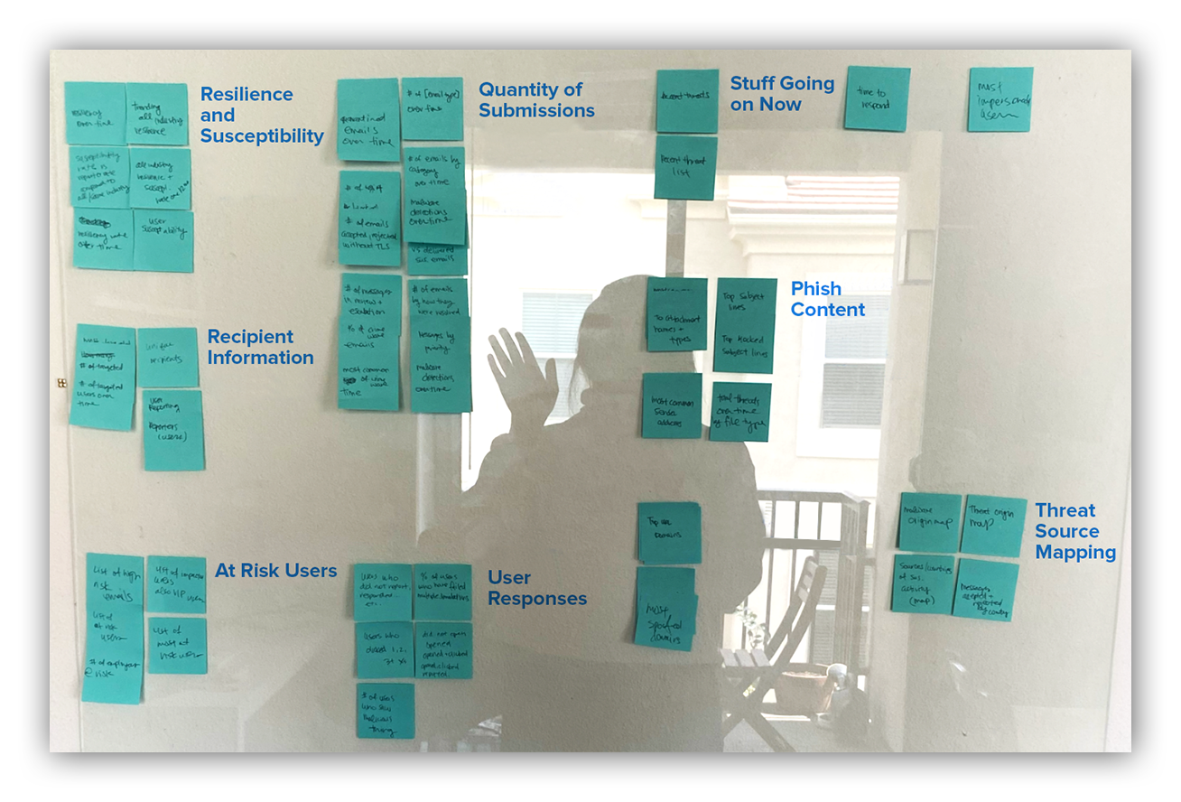
Photo of my analog card sort and my shadow self
These were some of the metric categories I came up with. But it’s actually not my opinion that matters the most here.
Remember, our customers are the ones I have to keep in mind when designing. After condensing the list of metrics down to a manageable number, I was able to run an unmoderated, completely remote card sort with a customer and EMs to see how they’d use these metrics, and if there were any metrics they thought were unnecessary or missing.
I’m proud to say that the categories these users came up with were quite similar to my own.
Reeling it in for feasibility and tackling visualizations
Once I had a shorter list of metrics and categories that would meet the goals for the Phishing dashboard, I knew I’d have to reel it in based on time and technical feasibility.
So, I met with the phishing engineers to discuss which items on the metrics list were realistic for a first version, and which metrics we’d have to revisit for a later version.
I let go of more complicated metrics like susceptibility by department and phish category (it’s bookmarked for a future version though… maybe don’t quote me).
But capturing key baseline metrics – being able to collect data and list out most common subjects, attachments, users and user accuracy – was definitely feasible.
The next step was figuring out how to most effectively visualize these metrics. I looked at popular dashboard designs, aesthetically pleasing dashboards and whatever showed up in ‘best dashboards’ searches.
I blocked out their visualizations to understand ideal page layout, the kinds of metrics and visualizations that got prioritized, and what kind of visual weight is given to any particular graph.
You can’t really just take a metric category and throw it into a pie chart and call it done. So much of good design in dashboards is finding the right visualization for the right group of metrics to tell the story that your users need.
For example, a group of metrics I knew we needed to show were:
- Total user submissions for a given timeframe,
- How many of those submissions were malicious; and
- How many of those submissions were benign.
It seemed like the most obvious visualization for this group would be to put it in a pie chart that shows the quantities in each metrics group and how they make up the whole of total submissions.
Or maybe the most obvious visualization is to just show the raw counts of these numbers, or in a funnel, like our Workbench™ Alerts Analysis Dashboard funnel.
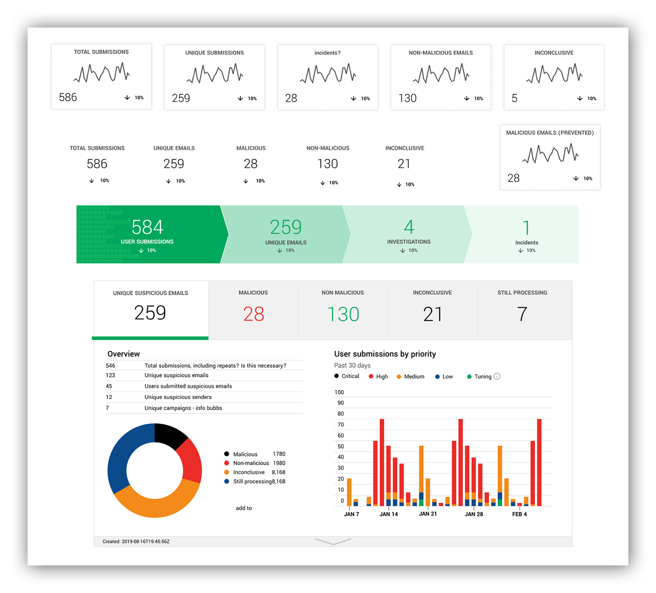
Example of straight counts, and adapting these metrics into graphics on our Workbench Alerts Analysis Dashboard
But in talking to customers, I already knew that the straight quantity of submissions and their subsequent outcomes wasn’t the interesting part of this data. In fact, showing straight quantities for this might be the least informative way of expressing this data.
The story is what’s important here.
Below is what ended up being the final version of this data visualization, and it offers so much more information than a pie chart could.
Customers are more interested in looking at how the outcomes of their suspicious emails trend, and whether or not there’s a spike. If there’s a spike, then you can investigate why there was a spike. You can interact with the legend to turn on and off certain outcomes, compare the lines and easily screenshot this for reports.
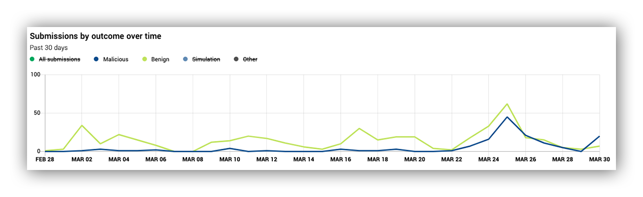
Example of Expel Phishing Dashboard line graph
Once I did this for all of the metric groupings that would appear on the Phishing dashboard, I laid it out and started chumming for feedback from current customers.
And, wahoo! The feedback was largely positive, and I made some adjustments to wording and changes to which graphs got to be the principal in the school of visualizations.
All aboard the Phishing dashboard tour
Let’s walk through the Expel Phishing dashboard 1.0.
Reminder: if you’re already an Expel customer, don’t be koi, you can preview and interact with this krill-iant dashboard in Workbench!
The image below shows submissions by outcome over time, which is what customers first look for upon landing here. You can look for spikes and trends in the data.
On the right, we have some information on malicious senders and how many emails are sent per sender. We also have the number of unique submitters so customers can see how many of their users are reporting emails as potentially phishy. This can be an indicator for how effective training or end user education is.
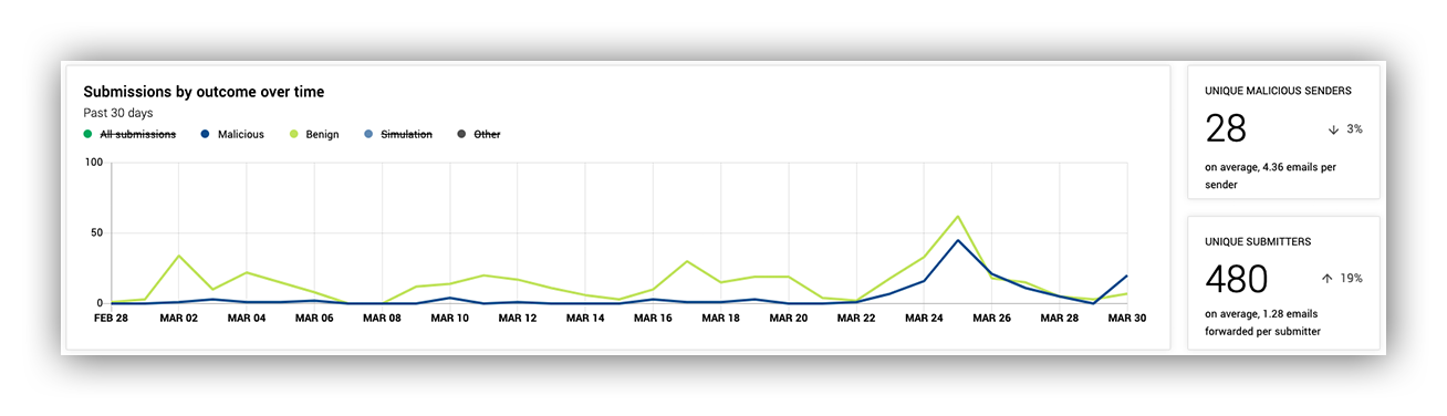
Expel Phishing Dashboard top level metrics of submissions over time and unique senders and submitters
Moving down the dashboard, second level on the left, we have a horizontal bar chart. This gives customers information about how many submissions we’re receiving from their users, and how many of those submissions turn into actual security incidents.
On the right, we have information on the frequent submitters of malicious, benign, and all email submissions to give customers insight into which users may need more training.
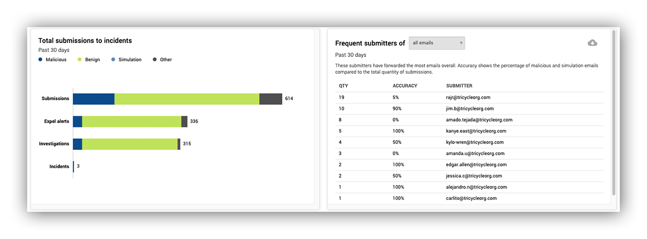
Metrics displaying how submissions funnel down to incidents, and submitter leaderboards
In the next image, on the third level on the left, we show customers the kinds of attachments that show up in malicious emails. This helps customers create custom rules in their secure email gateway (SEG) to limit similar incoming emails.
On the right is how often we use customer integrated technology to assist in our phishing investigations. This is to give customers an idea of their return on investment in their security vendors.
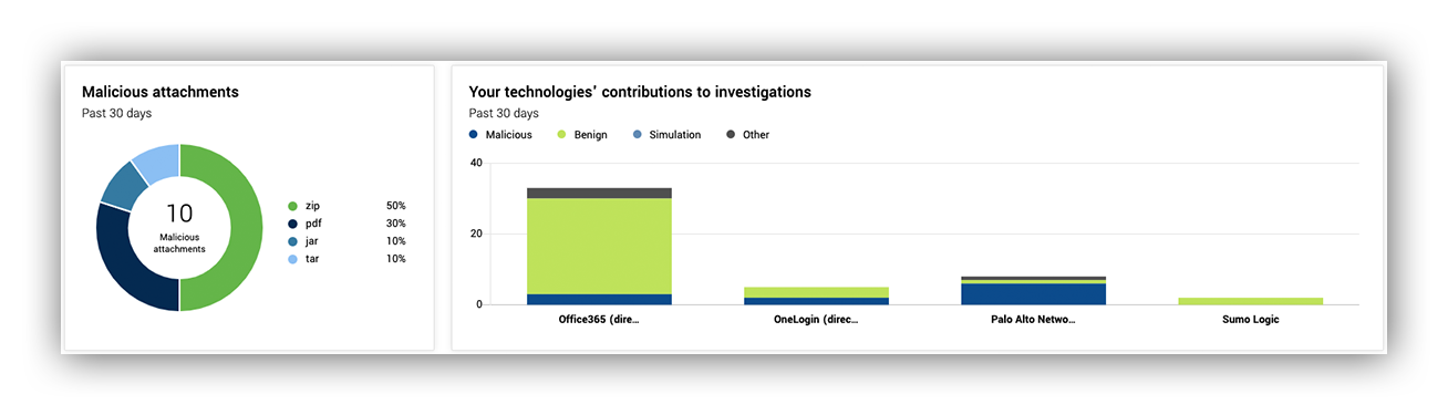
Information on malicious attachment quantity and how often our analysts leverage your tech in phishing investigations
Lastly, along the same vein as malicious attachments, we have frequent domains, senders and sender domains. This can help customers not only create rules in their SEG to limit incoming emails, but can also help them see if there’s a themed campaign against their org.
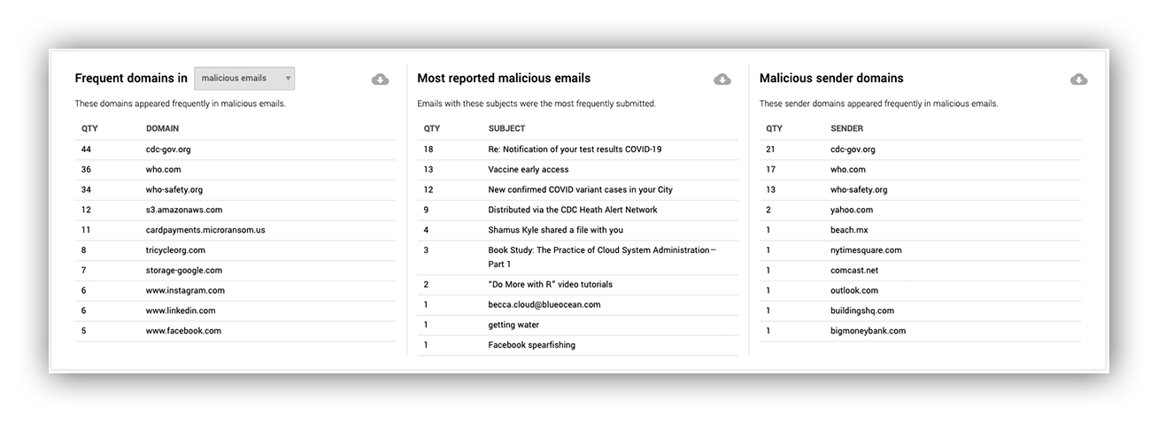
The final metrics on the Phishing dashboard provide information about recurring themes in malicious emails
Hook, line, and sinker
Of course, that’s not the end of my job, or the end of the Phishing dashboard. After all, this is only version one.
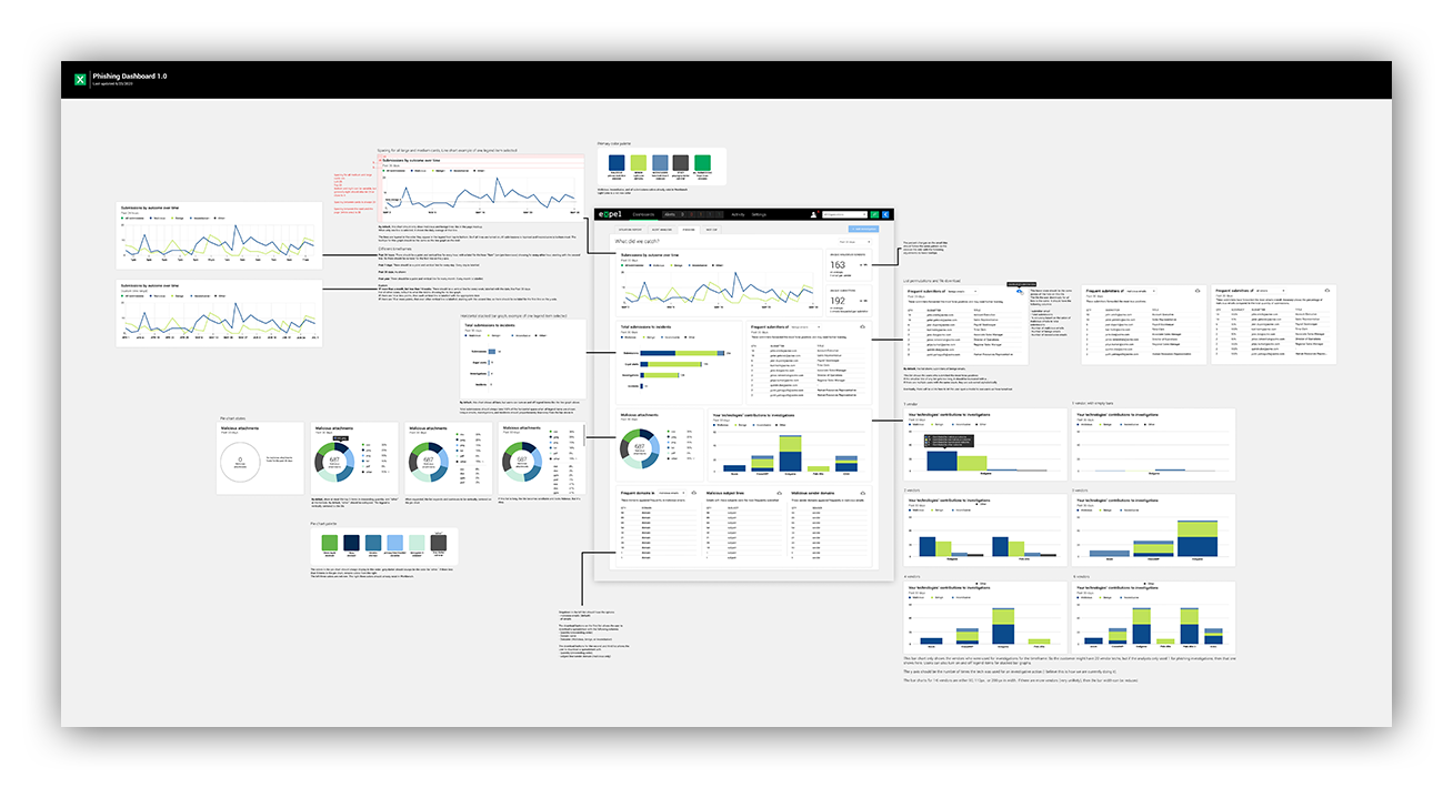
Bird’s eye view of the primary Phishing dashboard mockup
The Expel Phishing dashboard is on its maiden voyage, and I hope you enjoyed swimming alongside me. I’m excited to be on this journey with our Expel managed phishing customers and the rest of the Expel crew.
Want to see where we take the dashboard next? Hop aboard!


