
Metrics aren’t just for status reports, mmmkay. Effective SOC managers embrace data and use metrics to spot and fix problems.
At Expel, reviewing metrics and adjusting is how we take care of the team – and our customers!
In this part-two installment of our three-part blog series on all things SOC metrics and leadership, we’ll dive in a little deeper to explore how we use data to spot potential warning signs that SOC analyst burnout is ahead – a critical factor in SOC performance.
How to predict SOC analyst burnout
You know … that feeling of defeat?
When empathy is suddenly replaced with apathy because too many alerts are showing up, and they’re taking too long to handle?
Management just doesn’t seem to have their finger to the pulse on the current state of things?
Nothing changes because “that’s how we’ve always done it!” You begin asking: “Is this what I signed up for?”
Yeah, that’s what we mean by SOC burnout. And it’s common. In fact, it’s something many of us have experienced at prior jobs.
Just like investigations, effective operations management is rooted in the quality of questions asked.
In this blog post, we’ll share operations management metrics, the techniques we use to gather the right data and tips-and-tricks for how to analyze the data and implement your learnings.
Here’s what we’ll talk about:
| Operations Management Metric Question(s) | Technique | Tools |
|---|---|---|
| Did the daily mean number of alerts change? When did it last change? | Change-Point Analysis | Python – there are lots of examples on GitHub |
| What’s the daily alert trend? Is it up, down or steady? | Time Series Decomposition | Python – statsmodels.tsa.seasonal library |
| Is my alert management process in a state of control? Or are things totally borked? | Time Series Decomposition | Shewhart control chart |
If terms like time series decomposition, residuals, seasonality and variance are new to you – don’t worry. No previous experience required.
We’ll walk you through each of these operations management metrics and how these techniques are applied.
Metric #1: What’s the mean number of alerts we handle per day?
Technique: Change-Point Analysis
Tool: Python
TL;DR: You need to understand how many alerts show up each day. And if that number changes you need to know when and why.
You likely don’t have infinite SOC capacity (people), and if too many alerts are showing up relative to your available capacity, you’re going to be in trouble. Change-Point Analysis is our Huckleberry here.
 Elisabeth’s perspective: Change-Point analysis is a method for finding statistically significant changes in time series data.
What does statistically significant mean? In this case, that just means the change in alert data is significant enough to indicate that it’s more than just typical daily noise.
It helps us spot changes like these:
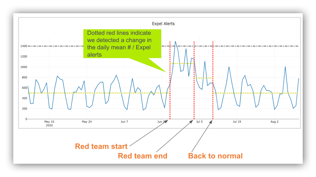
Change-Point graph showing where changepoints were identified in daily alert count data with context.
When we detect a significant change, we ask questions like:
- Did we onboard a new customer on that day?
- Did we release a new vendor integration?
- Did a vendor release any new features?
- Were there any big alert spikes?
- Is there any on-going red team activity?
Bottom line: If we don’t have an explainable cause, we dig deeper to understand what happened so we can adjust.
We then ask ourselves questions like: Do we need to spend time “tuning” detection rules? Do we need to write a new investigation workflow to automate repetitive tasks?
Sometimes we even ask ourselves if we just need to turn off a detection because the juice ain’t worth the squeeze.
 Jon’s perspective: Change-Point analysis tells me how many alerts we handle each day. When we see a significant change (up or down) we immediately spring into action to understand why.
For example, by looking at the Change-Point graph Elisabeth just shared, I was able to see that:
- Between May 1, 2020 throughJune 21, 2020 the daily alert count was relatively steady – the mean did not change.
- On June 21, 2020 the mean daily alert count doubled! Why? Cobalt Strike. It’s always Cobalt Strike. I’m not joking. It was a red team – the customer didn’t want to remove access – so we had a ton of true positive alerts for the activity. We were able to handle the increase by using tech (automation).
- On July 5, 2020 the mean daily alert count went down a bit as the customer removed BEACON agents.
- On July 13, 2020 things were mostly back to “normal.”
What did we do after looking at the data?
First, we noted the significant change. Then we quickly reviewed our detection metrics to understand why the daily alert count doubled (hello, BEACON agent).
Lastly, we used tech, not people, to handle the increased alert loading.
A super quick time series decomposition interlude
Technique: Time Series decomposition
Tool: Python, statsmodels.tsa.seasonal library
Elisabeth’s perspective: Time series decomposition is a method for splitting time indexed data into three pieces: trend, seasonality and residuals. This split is done in an additive way like you see in the below equation.
Trend + Seasonality + Residuals = Observed Value
Let’s break each piece down a bit further:
What’s the trend?
This is the general directional movement that we see in the data. You can think of this like smoothing out all the small bumps in the raw data to get a better view of the true directional movement.
What’s seasonality?
These are the repeated patterns that we see. Depending on how your data is aggregated, these could be hourly, daily, weekly, monthly or even yearly patterns. For example, when we look at daily aggregated data, we tend to see higher alert volume on weekdays compared to weekends.
What are residuals?
This is everything that is leftover after removing the trend and seasonality. This is basically the noise in the data, or the parts that can’t be attributed to the trend or seasonality.
To perform seasonal decomposition, we use the seasonal_decompose function from the Python statsmodels.tsa.seasonal library.
Since we’re running this analysis on aggregated daily alert counts, we prep our data by summing the total number of daily alerts and formatting the data to be date indexed.
Once the data is formatted, the basic seasonal decompose can be achieved with just a couple lines of code:
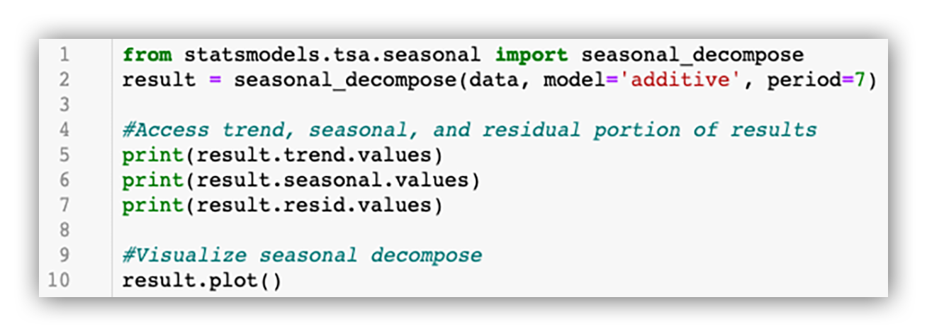
Seasonal_decompose function from statsmodels.tsa.seasonal
And here’s the resulting visual:

Output of `result.plot()`
Now our time series data is split into the trend, seasonality and residuals. This allows us to answer key operational questions that we’ll cover next!
Metric #2: What’s the daily alert trend?
Technique: Trend analysis
Tool: Tableau (or any visualization tool)
TL;DR: You can use what happened in the past to predict what will happen in the future. And what goes up doesn’t always come down unless we take action. We examine the daily alert trend to manage our alerts so they don’t manage us.
Jon’s perspective: One of the most important questions SOC leaders should ask is: What’s the daily alert trend?
Is the trend going up, going down, is it steady or do we see transient spikes? Your answer to this question will determine if and how you need to spring into action.
Recall from above, we use the seasonal_decompose function from the Python statsmodels.tsa.seasonal library to split our daily alert counts into three pieces:
- Trend
- Seasonality; and
- Residuals aka “the leftovers”
We do this via Jupyter Notebook to make it easy and export the results to a CSV that looks like this:
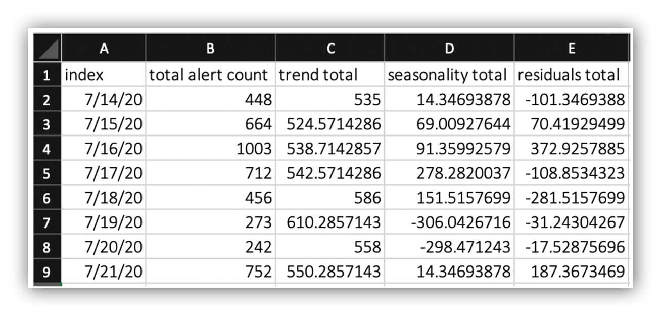
CSV output of Time Series decomposition
We then use a visualization tool, Tableau in this case, to examine the daily alert trend.
Here’s what that looks like:
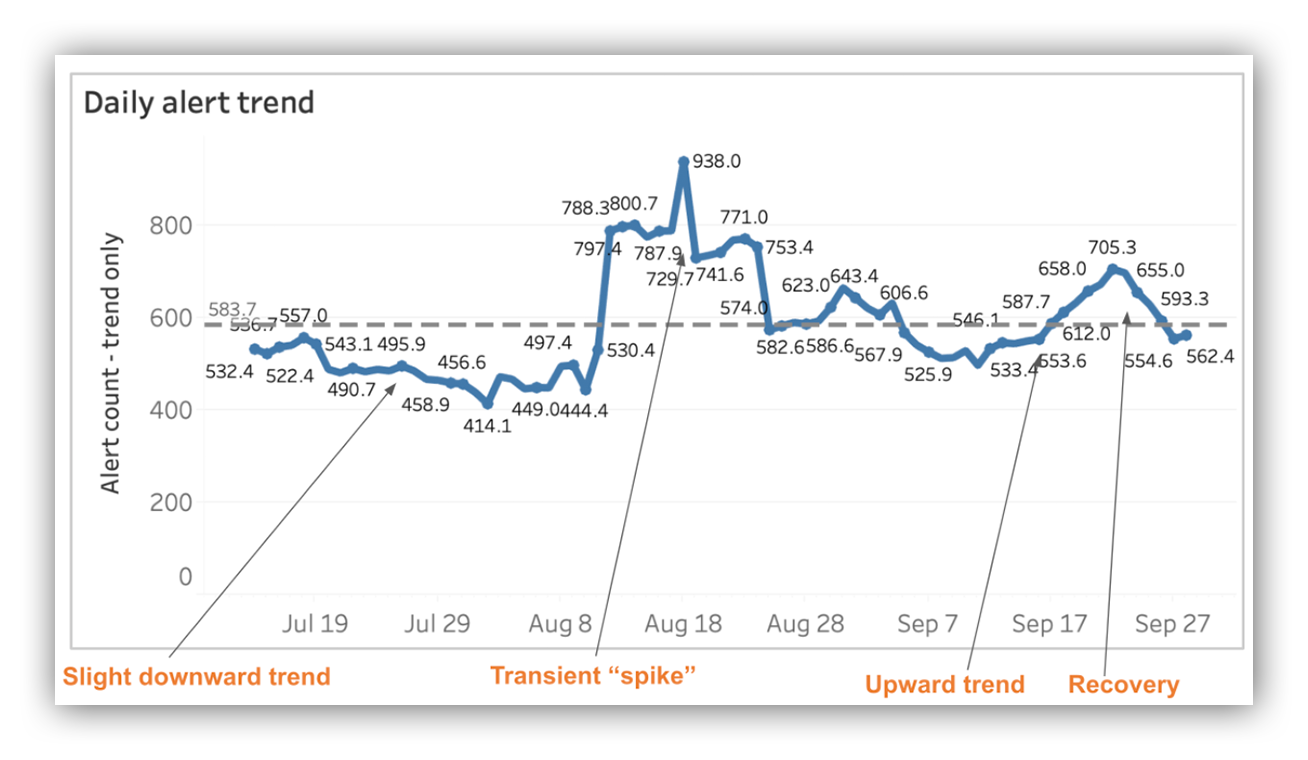
Daily alert trend visualization
Let’s talk about what’s going on here.
Between July 2020 and August 2020 we experienced a slight downward trend, but the trend was relatively stable. When we see something like this we take the action to make sure we weren’t over tuning and perhaps even be a bit more aggressive with detection experiments.
In the middle of August 2020 we see a couple big spikes mostly the result of a bad signature (it happens!) followed by a quick recovery to daily alert levels seen previously. Our call to action was to tune out the noise from the bad signatures.
In the middle of September 2020 things get interesting.
We see an upward trend that looks like a slow and steady climb. A pattern that looks like this always grabs my attention. This is very different from a big spike!
Why?
A slow and steady climb is likely indicative of more and more alerts showing up each day from different technologies.
More alerts + increased variety = heavy cognitive loading
And just like alerts, you have to manage cognitive loading. Because if you don’t, well, SOC burnout has entered the chat.
The call to action here is to understand the situation, figure out where the increased loading is coming from (new signature, product updates, etc.) and react. In this case two of the vendors we work with released product updates and we needed to tweak our detection rules to reduce false positive alerts.
In late September 2020, you’ll see a recovery to alert levels we’ve previously seen. This is exactly what we’re looking for!
Pro-tip: You can ask the team “how’s it going?” in weekly staff meetings or 1:1s, but I’ve found that by guiding the conversation using data, you’ll get better answers.
For example, you can instead ask: Team, the daily alert trend is on a slow and steady climb right now. As a management team we’re digging in, but what are you seeing?
Lead with data. It let’s the team know you understand what’s happening and that you have their backs. In fact, it enables you to ask better questions which will lead to more effective answers.
Hence why I say that metrics help you take care of the team.
Metric #3: Is alert management under control?
Technique: Statistical process control
Tool: Shewhart control chart and any visualization tool
TL;DR: Alert spikes are going to happen. But too many spikes can make it hard for a SOC analyst to find the alerts that matter.
“I only want to handle tons of false positives. Finding bad guys isn’t interesting”. – No SOC Analyst ever.
An alert management process in a state of chaos means your SOC analysts are likely feeling the burn.
Jon’s perspective: If you’ve spent time in a SOC, you know that bad signatures happen. You also know that experiments to answer “how prevalent is this string or packet globally” can sometimes lead to bad outcomes. And by a bad outcome, I mean tens of thousands or, in extreme cases, hundreds of thousands of false positive alerts.
Again, it happens. Which is why effective managers ask: Is alert management in a state of control?
To answer this question we use the residuals from our time series decomposition and a Shewhart control chart.
Recall that residuals are what we have remaining after we’ve extracted the trend and seasonal components.
If you’re unfamiliar with a Shewhart control chart here’s a quick TL;DR:
- It’s used to understand if a process is in a state of control.
- There’s an upper control limit (UCL) and lower control limit (LCL) – we use three standard deviations from the mean.
- Measurements are plotted on the chart vs. a timeline.
- Measurements that fall above the UCL or below the LCL are considered to be out of control.
Pro-tip: For folks just getting started with statistical process control, “Statistical Process Control for Managers” by Victor Sower is a great place to start.
Armed with our residuals, we plot them in a Shewhart control chart using Tableau.
Here’s the resulting visualization: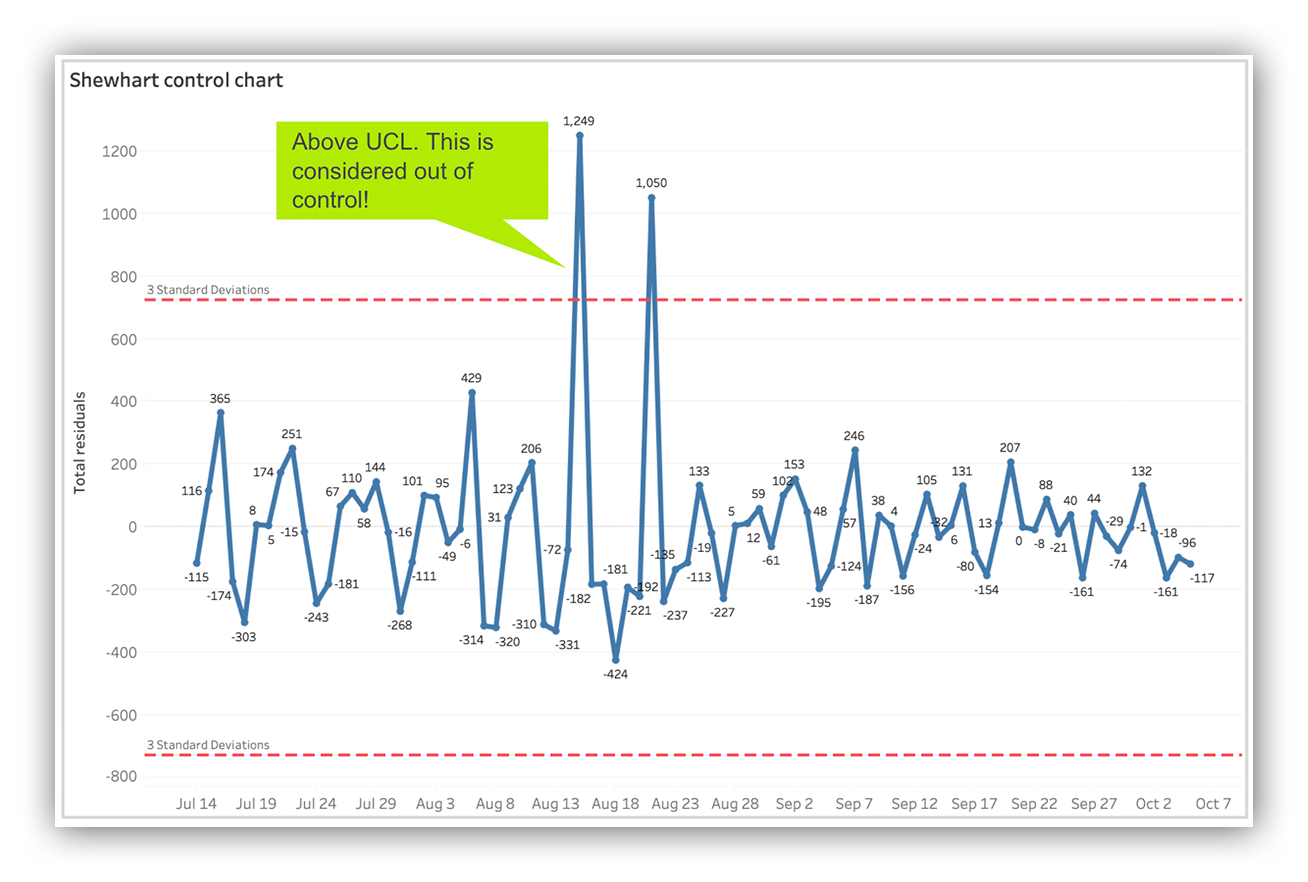
Shewhart control chart using alert residuals
You might be wondering; what are we looking for?
Well for starters, I’m looking for any days where our measurements exceeded the UCL or LCL. From the visualization above you can see there were two days in August 2020 when alert management was “out of control”.
On both days we encountered new vendor signatures that resulted in a high volume of false positives. But you can also see we were able to quickly get the situation under control.
I also look for periods of time where there’s more variance – and when I see more variance in our control chart that’s almost always paired with a slow and steady upward trend.
By plotting the residuals in a control chart we’re able to answer “is alert management under control” and if not, we can figure out why and react.
If we’re seeing more variance, we do the same thing! We dig in, ask questions and adjust.
We like to call this the “smoothed out trend.”
And we do this again and again and again. Effective operations management is a process, there is no end state! Monitor, interpret, react, adjust. Rinse, repeat.
Remember the “Why”
Super quick recap, promise.
We started by performing Change-Point analysis against our aggregated daily alert count.
Change-Point analysis let’s us know the daily mean, if it changed and when.
We then broke our aggregated daily alert counts into three pieces using time series decomposition: 1) trend 2) seasonality and 3) residuals.
We then examined the “smoothed out” trend using a visualization tool to understand what’s happening and then plotted the residuals in a Shewhart control chart to answer “is alert management under control?”
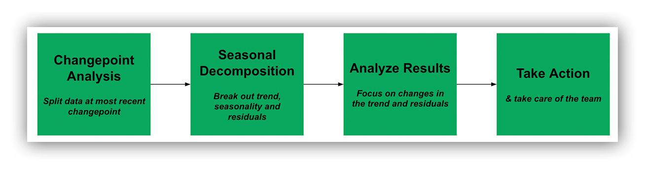
Alert operations management process
Remember the “why” with metrics.
Metrics aren’t just for status reports. Highly effective SOC leaders embrace data and use metrics to take care of the team. Again – if you’re not managing your alerts, they’re managing you.
If you’re not using data to spot too much cognitive loading – or finding ways to free up mental capacity – that’s a recipe ripe for SOC burnout.
And lastly, the quality of your operations management is rooted in the quality of the questions asked.
Think about the questions you’re asking today. Are they the right ones?
We’ve talked about metrics; how they create an efficient SOC and how they keep our analysts and customers happy.
In our last post, we’ll share some IRL examples of what this looks like within the Expel SOC.
Don’t miss it! Subscribe to our EXE blog now and be the first to read our third and final installment of our SOC metrics and leadership series.


")
