
“Test, learn, iterate” is a mantra that’s often repeated around the Expel office. I’m not sure exactly how “Test, learn, iterate” became a thing, but if I had a dollar for every time Jon Hencinski said it, I’d be living large on a private island somewhere.
One of the services we offer here at Expel is threat hunting, and earlier this year our team set out to enhance our existing offering. “Let’s build a new tool within our existing ecosystem to better support hunting,” we decided.
Building a better threat hunting tool
Of course “building a new tool” is no small feat. Before we put hands to keyboards, we needed to define what a “better” threat hunting tool would look like. What new features and capabilities do our customers want? What kind of data will we need to interface with? How will the analysts interact with that data? What kind of workflows will allow us to be more productive? How do we define and measure that increase in productivity?
The backbone of our existing threat hunting ecosystem is Expel Workbench — that’s our one-stop-shop for our analysts to triage alerts, investigate incidents and communicate important info to our customers.
While our hunting tools need to be baked into Expel Workbench, experimentation and rapid dev practices are out of the question in that environment.
The experimentation dilemma
Because experimenting directly in Expel Workbench can impact customers and the SOC, we started brainstorming other ways to iterate and test our new code that wouldn’t impact the day-to-day functionality of the system.
A few of us started using Jupyter Notebook as a training and development aid to assist analysts in learning new hunting techniques and providing decision support. If you aren’t familiar, Jupyter Notebook offers “an open-source web application that allows you to create and share documents that contain live code, equations, visualizations and narrative text.” We decided that if a Jupyter Notebook can provide structure to a workflow and decision support for analysts, why couldn’t we inject the data into the workflow and pair the data output with the decision support?
Using JupyterHub for threat hunting
To also address our need for rapid development, process isolation and ease of access for our analysts, we soon decided that using JupyterHub was a good approach — it’s a multi-user server designed for Jupyter Notebook. (If you want to learn more about JupyterHub, why we like it so much and the tips and tricks we learned along the way, check out this post: “Our journey to JupyterHub and beyond.”)
Jupyter Notebook gave us the freedom to rethink the way we analyzed data that was collected for hunting. Instead of only providing analysts with one large output of data to review, such as a CSV of results, we can now enrich the data with additional context from other events and partner APIs, we can graph or plot the data for visualizations and we can combine other references or artifact lookups into the interface where the analyst has quick and easy access.
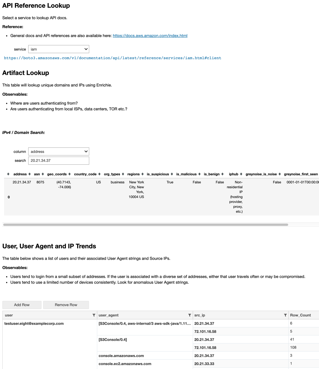
Image: Example of references, artifact lookups and event enrichment from an Amazon Web Services (AWS) hunt.
If you’re curious about using JupyterHub for threat hunting decision support in your own org, here are a couple tips we’ve learned and implemented that might be helpful to you and your team as you get up and running:
Use a template-based deployment design
If you’re like us, you’ve got many different hunting techniques and are always looking to add more to your library.
A template acts as a chassis that has all of the necessities baked into it. We decided to engineer a fully customizable chassis that is configurable by a YAML config file. This gives non-engineering folks the ability to self-service the creation of new hunting techniques.
In our ecosystem at Expel, we love to crowdsource our workloads across teams. The more people who can contribute to new hunt techniques, the faster we can turn out more high-quality hunts.
Our hunting template includes the ability to:
- Authenticate and interact with our Workbench API
- Ingest and normalize data from multiple source types and devices
- Enrich customer hunting data with approved third-party intel APIs
- Tag and annotate important or noteworthy data
- Suppress irrelevant or false positive data
- Sort, filter and search of all data in the hunt
- Relevant references, graphs, charts and tables for further context
- Report stats such as time to complete a hunt, number of findings
- Generate audit trails, such as what data is being suppressed or reported
- Add raw data to a formatted findings report in Workbench
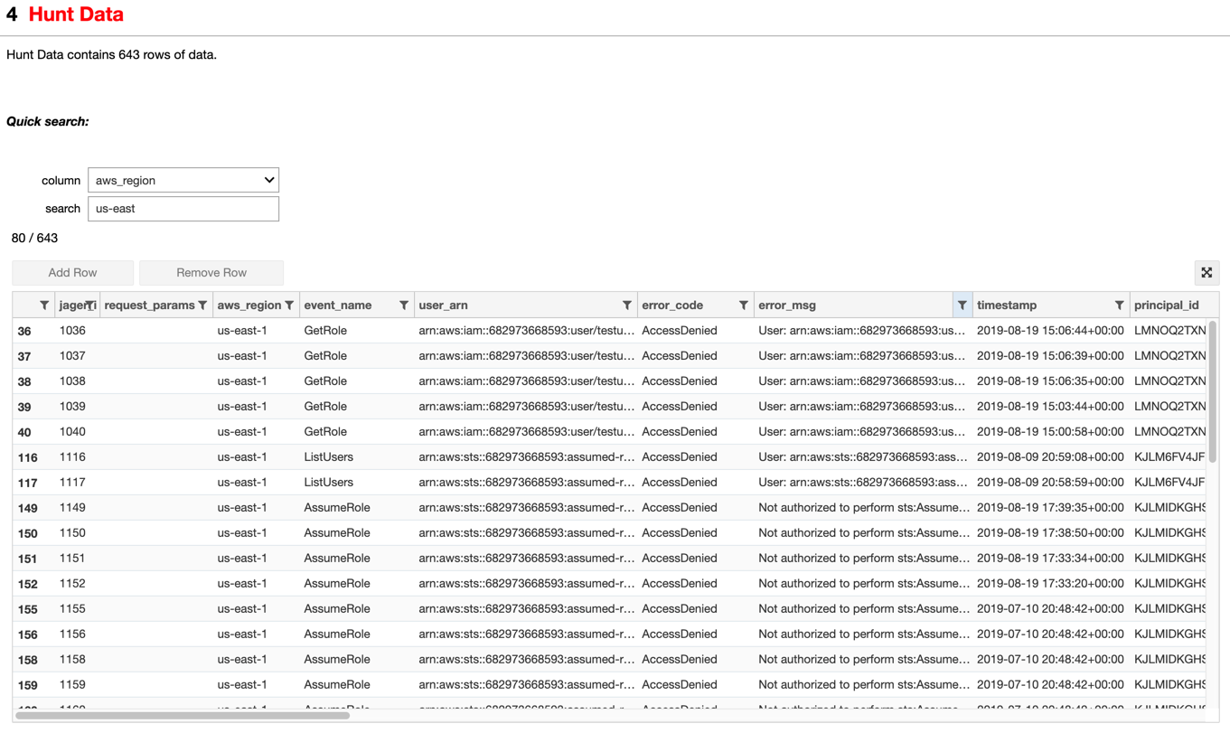
Image: Example of sort, filter, search of all data in the hunt from an AWS hunt.
Create a method for capturing and reporting user stats
It’s tough to get users to provide you with quality feedback. Everyone is busy and wants to be helpful but honest, quality feedback is hard to come by and in general response rates are often low.
We do have a process for collecting feedback, feature requests and bugs; however, if you collect lots of user metrics, your results will start to tell a story and guide you toward what’s working and what’s not — without ever having to bug your users to share their feedback.
If you build this into your template early, you can standardize on the stats you’re going to have in all of your future technique deployments. This is absolutely key if you want to “test, learn and iterate.” The majority of what we learn comes from trends we discover in our metrics — and then we’re able to easily make adjustments to our processes based on what we learn from our users.
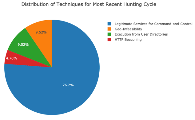
Image: Example graph from our metrics notebook.
Don’t forget about enrichment
Enrichment is key to a successful hunting program. Enrichment is taking an artifact and using it to derive additional information or context. For example, from an IP address artifacts, we can enrich it to find out the geolocation or its origin, the owning organization, whether the owning organization is an ISP or a hosting provider. With this additional information, we can now draw new conclusions from our IP address artifact.
Raw logs for two different logon events will appear nearly identical at first review to an analyst.
However, if you add enrichment data — like the owning organization of the source IP address, the geo-location of the source IP address or whether the IP address is associated with TOR or a datacenter — all of a sudden the data becomes dimensional and anomalies start to stand out.
There’s tremendous value in tags, annotation and suppression
From month to month, environments change because of administrative updates, software updates and patches. Sometimes we’ll conduct a well-established hunt technique, yet we get unexpected results due to recent changes in the environment.
We found it’s invaluable to give analysts the ability to tune the hunt on the fly. Additionally, sharing information between analysts from hunt to hunt and month to month has proved to be valuable, too.
For example, if an analyst confirms that it’s normal for Employee A at Organization Y to frequently log in from both the New York City and London offices, then the analyst can tag this type of activity. Then other analysts conducting future hunts don’t need to repeat the same investigative legwork later, only to arrive at the same “business as usual” conclusion.
Allow for internal auditing
Our tags and suppressions help us deliver efficient hunting results.
That’s why we built a special notebook just for auditing all our tags and suppressions. Senior analysts regularly review our tags and suppressions for accuracy and quality. Since we already have a regular cadence for quality assurance, we decided to also pull a sample set of findings reports into this notebook in order to review and improve our final delivery formats for our customers.
This helps us all learn and improve, and allows us to iterate on our processes and deliverables to better serve our customers.
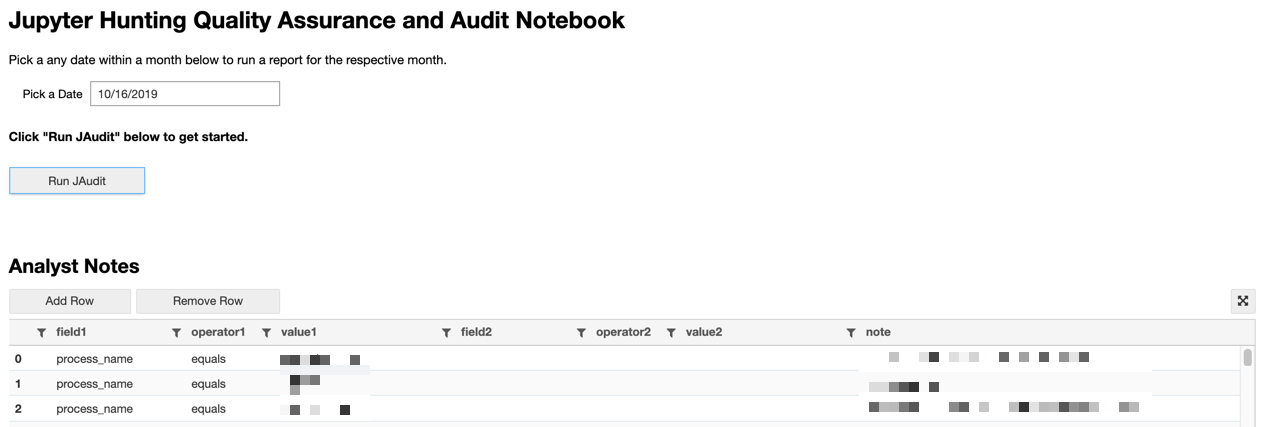
Image: Preview of our quality assurance and audit notebook.
Embrace downselects
Downselects are what we call the smaller subsets of data that focus on a key aspect of the technique or generate a frequency count. Downselects can be reference links, graphs, charts, timelines, tables or a mini stats report.
We found that it’s great to have a few on each hunt; however, we also discovered that too many can be distracting and cause an analyst to feel disconnected from the overarching technique. We’re still iterating on this one, and will report back soon (maybe even with a follow-up blog post).
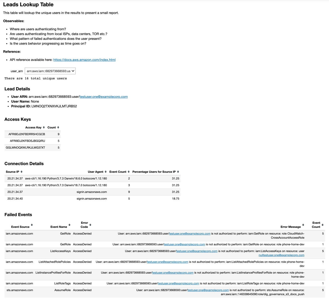
Image: Example of a mini stats report from an AWS hunt.
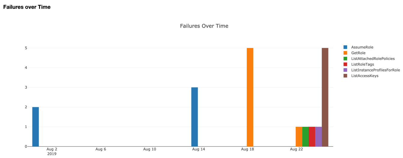
Image: Example of a graph from an AWS hunt.
Consistency can help drive efficiency
At Expel, we strive to give all our customers a tailored experience. But there needs to be a careful balance between customization and consistency in order to drive efficiency.
We’ve chosen to have our analysts write unscripted, detailed messages to our customers regarding items identified in a findings report. Many other MSSPs and MDRs automate these. However, to maintain efficiency and a higher standard of delivery, we decided to import the analyst’s message into the code and format the overall findings report. Also, instead of having a custom set of downselects written for each hunt, we wrote a library of a few good downselects, like a widget that displays frequencies of recurring events, a bar chart that displays the number of events over time, and a widget for looking up domains and IPs using our partner APIs. We can reuse these downselects between different hunts to reduce the overall amount of code and maintain consistency for our analysts between hunts.
Fewer panes of glass drive efficiency
Nobody likes looking through multiple panes of glass to conduct a hunt technique.
We learned this early on. We used to have analysts hunt in one browser tab, with a suggested workflow and technique guide in another browser tab. We quickly discovered it’s too hard to keep flipping back and forth.
In our current template, we keep the same layout to maintain consistency for analysts between different hunting techniques, which reduces the amount of “jumping around” between different tasks within the workflow.
Our layout includes the following items in this order:
- Authentication handler for various APIs
- Overview of the hunt technique
- What pre-filtering has already been applied during data collection
- Key things to look for and what evil might look like
- Suggested containment or remediation steps if evil is identified
- Analyst notes, tags and suppressions
- We just show what is relevant to the active hunt and hide inactive tags and suppressions
- Hunt data
- All of the unsuppressed results are displayed here with the ability to sort, filter and search
- Downselects
- Each downselect includes four keys in the YAML config file:
- Title: High level summary of what the downselect does
- Description: How is the data being manipulated or filtered and why
- Observables: This is a list of very specific things the analyst should watch out for that would represent indicators of known evil
- References: This is a list of internal and third-party resources where the analyst can learn more about the specific security aspect or indicator focused on by the downselect; it includes things like links to specific MITRE Att&k articles or reputable blog posts
- The downselect data; sometimes the data is a table which can be sorted, filtered and searched but other times it’s a bar chart, diagram or map
- The downselect data appears directly in line and above the reference data to reduce pivots for the analyst
- Each downselect includes four keys in the YAML config file:
What we’re seeing so far
Now that we have better stats for hunting, we have a clearer understanding of the volume of data our analysts are reviewing, what hunts require more or less time to analyze and complete and the amount of findings being reported by our various hunts.
It’s still early for us when it comes to collecting metrics, but we’re starting to make more informed decisions about what hunts are working, why they’re useful and where they tend to work best. This will help us continually improve our overall hunting program.
What’s next
We’re still in a “test, learn, iterate” phase when it comes to JupyterHub, improving our hunting tools and techniques over time.
As we identify the things that work best for our analysts, we’re recording those items for our blueprints and wish lists and making continuous improvements to our hunting program.


