
Ask a SOC analyst whether brute forcing alerts brings them joy and I’ll bet you’ll get a universal and emphatic “no.”
If you pull on that thread, you’ll likely hear things like “They’re always false positives,” “We get way too many of them” and “They never actually result in any action.”
So what’s the point? Should we bother looking at these kinds of alerts at all?
Well, as it often turns out when you work in information security … it’s complicated.
Although detections for brute forcing, password spraying or anything based on a threshold are created with good intentions, there’s always a common challenge: What’s the right number to use as that threshold?
More often than we’d like to admit, we resort to hand waving and “following our gut” to decide.
The “right” threshold is hard to determine and as a result we end up becoming overly sensitive, or worse, our threshold is so high that it causes false negatives (which isn’t a good look when a real attack occurs).
At Expel, we’ve been working since day one to achieve balance: ensuring we have the visibility we need into our customers’ environments without annoying our analysts with useless alerts.
How data and tooling can help
As it turns out, security and DevOps challenges have quite a bit in common.
For example, how many 500 errors should it take to page the on-call engineer? This is similar to a security use case like password spraying detection.
These shared problems mean we can use a suite of tools that are shared between security and DevOps to help tackle security problems. Some of our go-to tools include:
- DataDog, which captures application metrics that are used for baselining and alerting; and
- JupyterHub, which provides a central place for us to create and share Jupyter Notebooks.
Step 1: Gather the right data
To arrive at detection thresholds that work for each customer (by the way, every customer is different … there’s no “one size fits all” threshold), we need to collect the right data. To do this, we started sending metrics to DataDog reflecting how our threshold-based rules performed over time. This lets us monitor and adjust thresholds based on what’s normal for each customer.
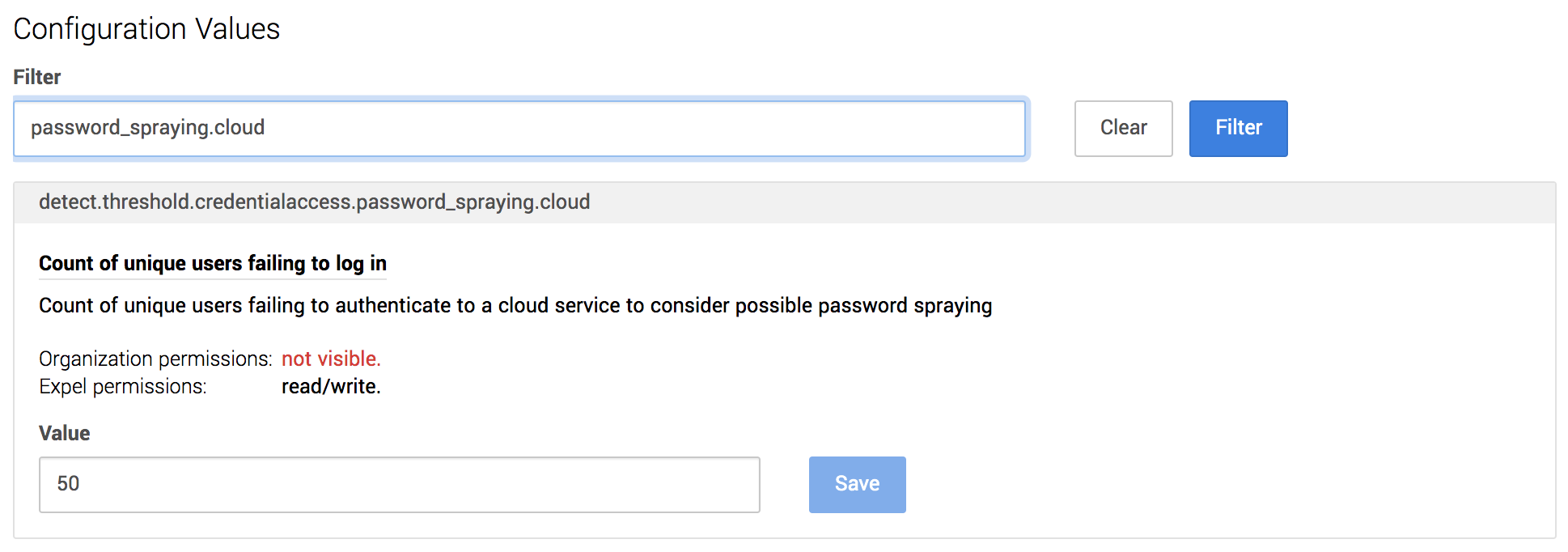
For example, as our detection rule for password spraying processes events, it records metrics that include:
- Threshold Value, which is the value of the threshold at the time the event was processed; and
- Actual Value, which is how close we were to hitting the threshold when the event was processed.
By charting these metrics, we can plot the performance of this detection over time to see how often we’re exceeding the threshold and if there’s an opportunity to fine tune (increase or decrease it):
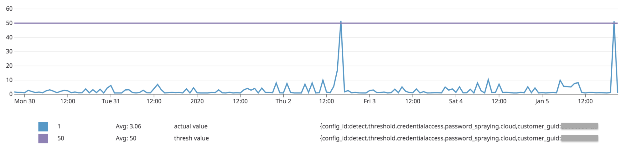
This data is already useful – it allows us to visualize whether a threshold is “right” or not based on historical data. However, doing this analysis for all thresholds (and customers) would require lots of manual work.
That’s where JupyterHub comes in.
Step 2: Drive change with data
Sure, we could build DataDog dashboards and manually review and update thresholds based on this data in our platform but there’s still room to make this process easier and more intuitive.
We want to democratize this data and enable our service delivery team (made up of SOC analysts, as well as our engagement management team) to make informed decisions without requiring DataDog-fu.
Additionally, it should be easy for our engagement management team to discuss this data with our customers.
This is exactly why we turned to JupyterHub — more specifically, Jupyter Notebooks.
We’ve talked all about how we use JupyterHub before, and this is another great use case for a notebook.
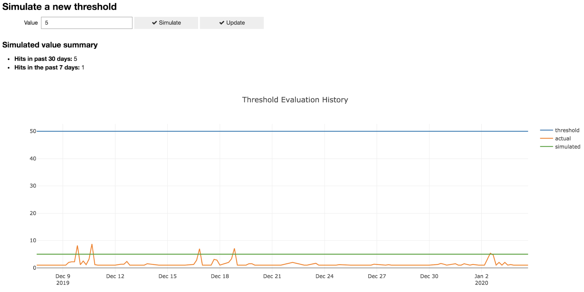
We created a Jupyter Notebook that streamlined threshold analysis and tuning by:
- Querying DataDog metrics and plotting performance;
- Allowing the simulation of a new threshold value; and
- Recommending threshold updates automatically.
As an example, a user can review a threshold like below, simulate a new threshold and decide on a new value that’s informed by real-world data for that customer. This lets us have more transparent conversations with our customers about how our detection process works and is a great jumping off point to discuss how we can collaboratively fine tune our strategy.
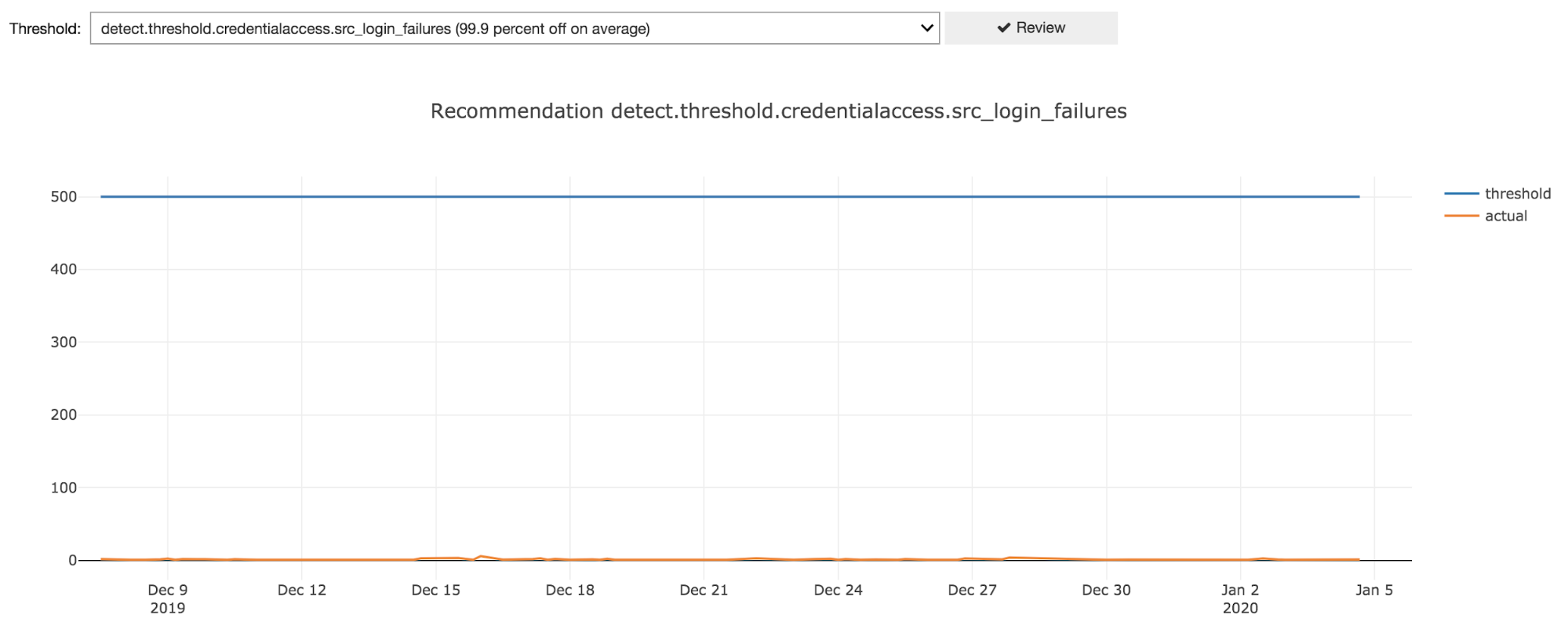
Additionally, we added a feature to automatically review historical performance data for all thresholds and recommend review for thresholds that appear to be too high or too low. There’s room for improvement here but we’ve already had luck with simply looking at how many standard deviations off we are from the threshold value on average.
For example, here’s what a threshold that is set way too high looks like:
By automating data gathering and providing a user interface, we enabled our service delivery team to review and fine tune thresholds. JupyterHub was key to our success by allowing us to quickly build an intuitive interface and easily share it across the team.
Step 3: Correlate with additional signals
Arriving at the right threshold for the detection use case is one important part of the puzzle, but that doesn’t completely eliminate the SOC pain. Correlation takes you that last (very important) mile to alerts that mean something.
For example, we can improve the usefulness of brute force and password spraying alerting by correlating that data with additional signals like:
- Successful logins from the same IP, which may indicate a compromised account that needs to be remediated;
- Account lockouts from the same IP, which can cause business disruption; and
- Enrichment data from services like GreyNoise, that help you determine whether this is an internet-wide scan or something just targeted at your org.
By focusing on the risks in play and correlating signals to identify when those risks are actually being realized, you’ll significantly reduce noisy alerts. Every detection use case is a bit different, but we’ve found that this is generally a repeatable exercise.
Putting detection data to work
Detection data — in particular, knowing what true negatives and true positives look like — gives us the capability to more effectively research and experiment with different ways to identify malicious activity.
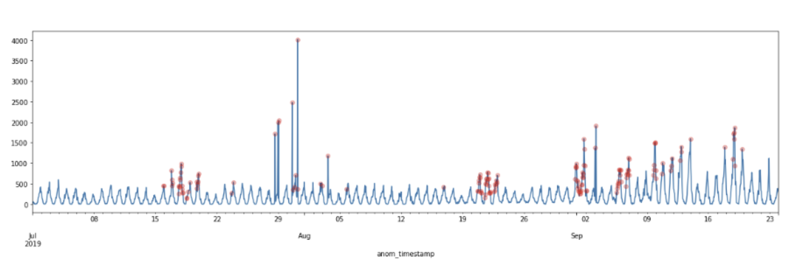
One example of this comes from our data science team. They’ve been looking into ways to avoid threshold-based detection to identify authentication anomalies. The example you see below shows how they used seasonal trends in security signals for a particular customer to identify potential authentication anomalies. By using that seasonal decomposition combined with the ESD (Extreme Studentized Deviate) test to look for extreme values, we can identify anomalous behavior that goes beyond the usual repetitive patterns we typically see. Thanks to these insights, we can automatically adjust our anomaly thresholds to account for those seasonal anomalies.
We’re lucky to have tools like DataDog and JupyterHub at our disposal at Expel, but improving detections is still possible without them.
If you haven’t yet invested in new tools, or are just getting started on continuously improving your detections, ask the following questions of the team and tools you already have:
- What does “normal” look like in my environment? (ex: 10 failures per day)
- When is action required? (ex: when an account is locked)
- What other signals can we correlate with? (ex: login success)
- How many true positive versus false positive alerts are we seeing?
Questions like these give you the ability to reason about detection in terms of your environment and its unique risks.
Regardless of where the answers come from, this feedback loop is important to manage your signal-to-noise ratio and keep your analysts happy. Big thanks to Elisabeth Weber for contributing her data science genius to this post!


