
If you search for “how to measure cybersecurity” or “cybersecurity metrics,” you’ll wind up with an endless list of resources that all claim to have the definitive collection of metrics you should use to measure your cybersecurity program.
I’m not going to specifically tell you what you should measure. The devil is in the details – every process has its hidden complexities that keep any “one size fits all” approach from working particularly well.
Instead, I’m going to share my perspective on what you need to bring to that metrics meeting in order to have a productive, meaningful conversation about the business.
How I think about cybersecurity metrics (and why)
When I think about talking about metrics, my mind naturally moves to art history.
As a thought experiment – take a look at this painting.

If you’re not an art history enthusiast, you may just go, “Wow, that thing is bananas!”
This is a pretty common reaction – perception overload.
If I try to explain the painting by saying, “Hey, that’s Medusa’s head right in the middle there,” the problem actually gets worse – now you’re trying to figure out why Medusa’s head is there. Wasn’t that in a movie or something?!?
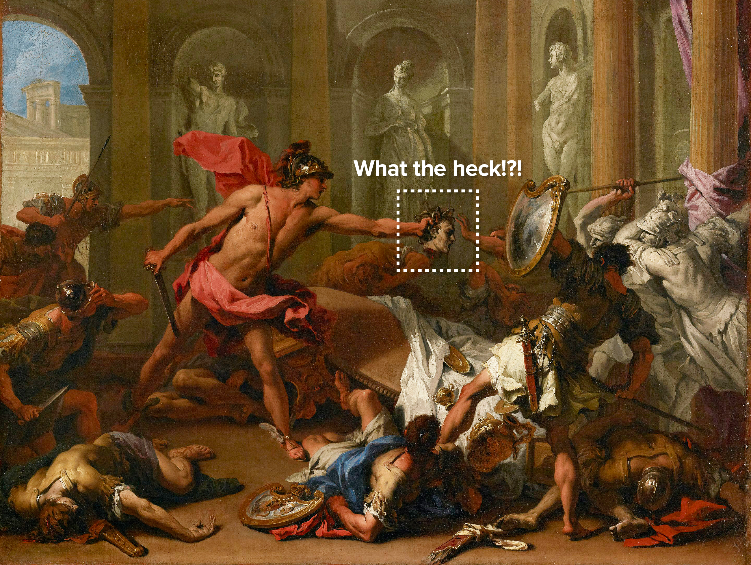
It’s not that much different attending a slide-driven metrics meeting if we’re not on our game.
How to measure cybersecurity
Start with context
It’s the understanding here that’s missing, which is critical. Whether it’s art history or metrics, we can’t engage the brains of our audience unless we give them some context to connect with.
With art, it might be that we just miss out on enjoying a painting, but with metrics, we make decisions based on that (possibly flawed) understanding.
Instead of diving right in, what if I introduced the painting to you with this?
This oil painting by Sebastiano Ricci is a good example of 18th century Italian painting. It depicts a scene from Greek mythology. During the wedding between Perseus and Andromeda, the happy couple was attacked by a mob led by a jilted suitor.
Perseus, located in the center of the image is using the severed head of Medusa (whom he earlier bested in combat to win the hand of Andromeda) to turn some of his attackers to stone. This is seen on the far right of the image, as two of the attacking figures are statues. The attack is ongoing, as seen by the bodies of the wedding guests scattered in the foreground.
The painting makes heavy use of diagonal posing to give the impression of movement and action and is a good representation of the late baroque period, where the use of chiaroscuro, or the interaction between light and dark tones in a painting were used to convey mood and meaning.
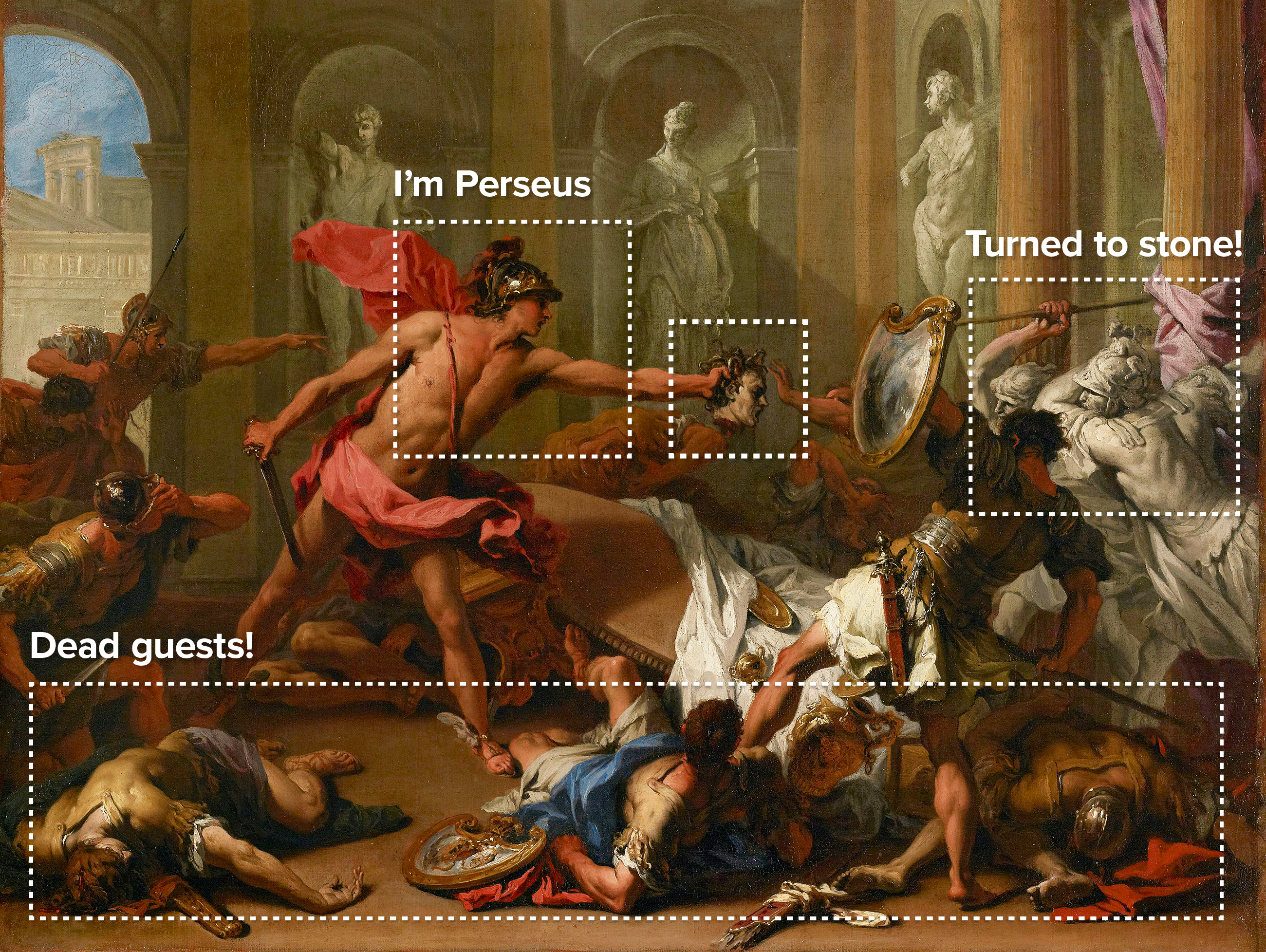
Now the painting starts to make sense.
It’s amazing how much detail we can spot once we have a framework to hang the detail on.
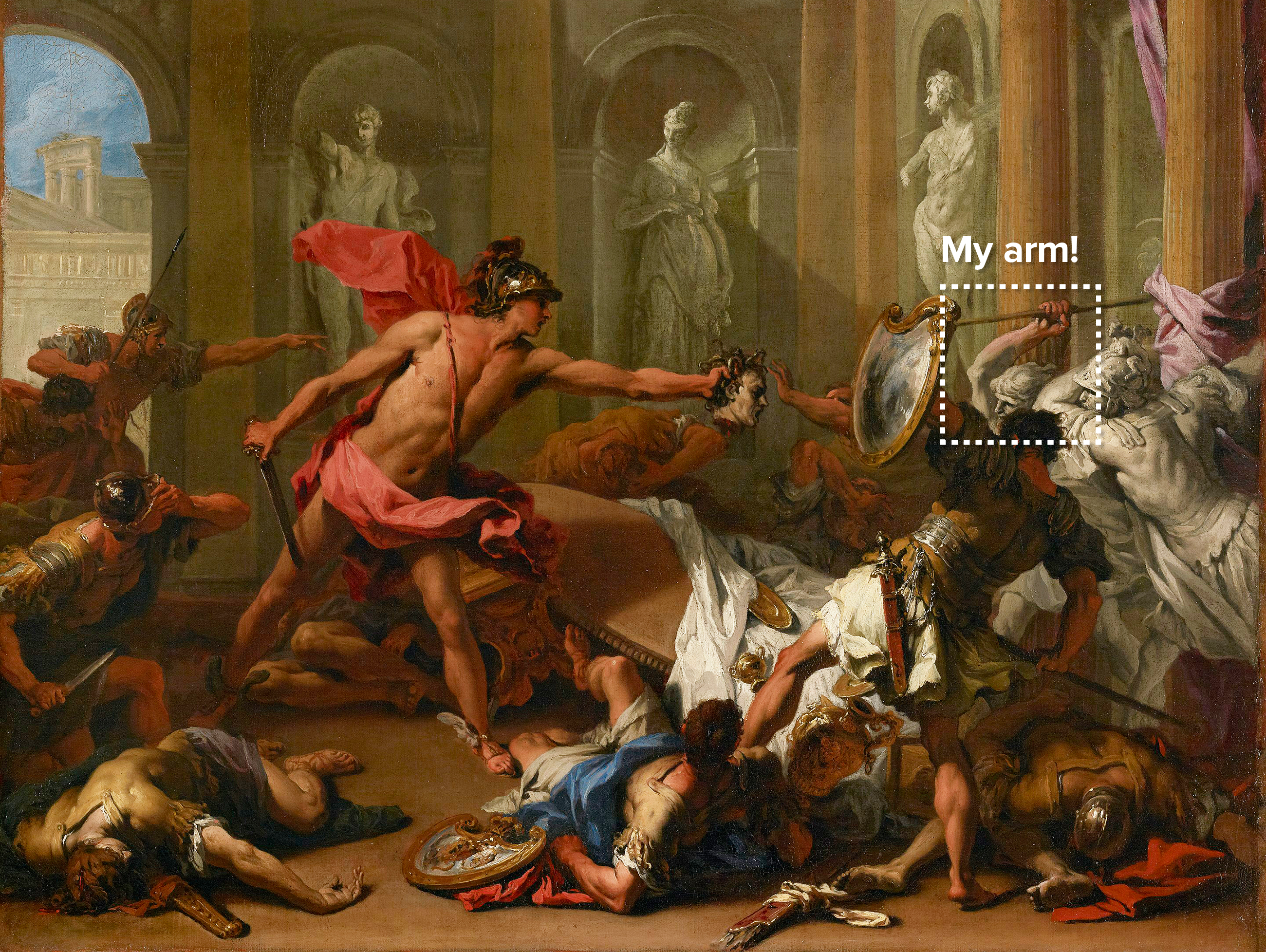
Now that we know what to look for, we might even notice that one of the attacking soldiers is in the process of being turned to stone, as his arm is half grey and half normal color.
In the description of the painting, we provided a brief introduction of who painted the thing, and when. This gives the audience a second to adjust their expectations. If I said, “this is a neolithic cave painting,” and then showed you this painting, the reaction would’ve been stark.
In the context of metrics, this usually sounds like: “We’re watching our mean-time-to-remediate because it’s key to understanding if our team is overloaded.”
How to measure cybersecurity: Articulate the questions you want to answer
As you’re thinking about the context you want to offer during the metrics discussion, think about the questions you want answered (or the questions and answers the group might expect of you).
For example:
- Are these metrics of particular importance?
- What story do the metrics tell us?
- How did we collect them and from what process?
- Why do you need two minutes of time to talk about this?
We started with an introduction: “This is a painting of….” followed by introducing the main characters and offering some smaller details. We want to move through the scene with multiple passes, each pass having slightly more detail than the last. We don’t start with, “Look, it’s Medusa’s head!”
When talking about a cybersecurity metrics, this might sound like:
“This is a graph of [X], you can see that generally it’s [Y]. One thing to note is [Z].”
Studying the data and the graph can help you pinpoint any trends or oddities you might want to share as you’re offering context. For example:
- What’s the scale of the graph? Are there two scales? Call that out.
- Is there a trendline we need to be aware of?
- Are there multiple lines? If so, why?
How to measure cybersecurity: Add structure to the discussion
Once your audience has the general sense of what’s going on, move on to the big stuff.
Let’s use our painting example again. The foreground is dead bodies, the right side is people being turned to stone. This is how the audience is going to get a sense of what’s going on.
In a metrics presentation, this might sound like: “You’ll notice the overall trend is increasing for the period…” or “We saw a sharp dip, followed by a recovery…”
The questions you’ll likely want to think about here are big structures in the graph:
- Is it periodic? If so, why?
- Is there a trend?
- Are there any big dips or spikes?
- What do we not see that we were expecting? (e.g. “Normally we’re 2x this rate, but not this month because…..”)
How to measure cybersecurity: But what does it mean?
At the end of the description I shared with you, I talked about why this painting was important – it’s a good example of the baroque period. The idea is that this part is the invitation for us to consider something larger about the painting – above the reach of the characters and the action.
But why do we care?
In a metrics conversation, it sounds like: “What does this mean? What are we going to do about it?”
Without these questions and answers, metrics are just another nice graph.
Questions you want to think about here are:
- If there’s a trend, what does it relate to? Is it a natural phenomena? Do we expect it to stop?
- If there are big spikes, what happened? Are they good or bad for business?
- Do I need to be worried, excited or just informed about what I’m seeing?
This is usually where people get stuck.
If you’re having trouble coming up with the meaning of the metric or graph, ask yourself two things:
- What would it take for us to change the value of the metric over the next day/week/quarter?
- Would we want to?
If you can’t answer those two questions, it’s likely you’re showing a metric that isn’t all that useful.
What to avoid during your metrics discussion
In a metrics meeting, avoid reading data, titles or legends off the graph — instead, dive into the context.
What I didn’t do when describing the painting is say, “The painting is of a large room. At 10 o’clock you can see through a window to the outside, which is lighter…”
Avoid the temptation to use words to describe what people will see. Use words to help them see something they can’t see.
We’re trying to understand what the painter was trying to communicate, not what they painted. “In Baroque art, the artists were experimenting with the use of light and dark colors. You can see this at 10 o’clock in this painting, where the view outside is light, contrasting with the dark scene in the room.”
How do you know you’re doing it right?
What all of this translates to when presenting metrics is a combination of audience engagement and identifying or taking next steps.
If you’re on the right track, people will:
- Ask questions about what you’re presenting. (This is usually a good sign, unless their question is: “What the hell?”)
- Interact with the structure of the metric with an eye toward meaning. This might sound like: “I see this in the graph, what causes it?” or “Is the uptick here a cause for concern?”
What does this look like in practice?
If we’re doing our job well, then our metrics meetings will sing and our business will prosper.
Let’s ditch the painting example and share a real-life example of a metric our team recently presented to our colleagues.
What we see below is a time series of the number of unique submissions to our phishing service for the last two months. The counts are given at a weekly granularity, where phishing campaigns consisting of more than one email are rolled up into a single count.
The overall trend-line, here plotted in grey, is showing a steady increase – this is expected, as we’ve added a number of new departments over the period.
We also see that the variance is increasing – the high/low swings increase in size over the back half of the period. We believe this is due to new departments being added over the holiday period. This effect should smooth out over the next few months.
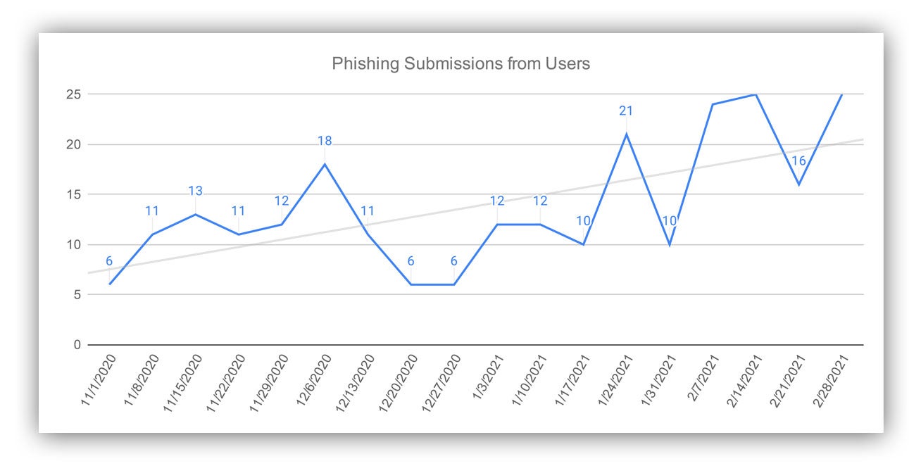
Example phishing submissions graph
What makes all of that useful?
- Context: I told you what it was a graph of. I didn’t tell you the high and low watermark – you can read that. But I did tell you what the numbers meant and how we calculated them.
- Multiple passes: I told you about the line and what it’s doing, as well as the trend line and what it’s about.
- Structures and functions: I called attention to the mean and the variance, which are both increasing.
- Meaning: I told you why the mean and variance were increasing, and what you should think about that.
Want to read more of our thoughts on cybersecurity metrics, and how we apply some of this thinking in measuring our own Security Operations Center (SOC)? Check out this post and this post.

")

