
TL;DR
- Our goal with this project was to drill into incidents and find out what separated a strong incident from one that was at risk of being missed
- We’re sharing our mathematical process on how we calculated incident strength, including what worked and what didn’t
- Knowing the difference between strong and risky incidents can drive detection strategy improvements
How do you measure the quality of an incident as it relates to your detection strategy? We’re not talking about response times, such as time to remediate or time to investigate. If you’re comparing two incidents, what, if anything, makes one better than the other in regards to how you detected it? Is it the more alerts you have, the better it is? We would say, “Yes, within reason” (you don’t want an incident with thousands of alerts).
A single point of success is also a single point of failure. But a simple count doesn’t distinguish an incident with ten unique detections and one loud detection triggering ten times. Follow that up with a unique count of detections in an incident, and the problem becomes: What are the proportions of those unique detections? Is the incident over-reliant on a single detection, or are they proportional?
Consider three different incidents:
| Incident name | Detection A | Detection B | Detection C | Total |
|---|---|---|---|---|
|
Incident 1 |
1 | 1 | 1 | 3 |
|
Incident 2 |
10 | 1 | 1 | 12 |
|
Incident 3 |
4 | 4 | 4 | 12 |
While all three incidents have the same count of unique detections, their proportions vary. If detection A breaks, suddenly you have two individual chances in detection B and C to catch the activity in incident one and two. However, if the same happens to incident three, you still have eight alerts because it isn’t overly dependent on a single detection, making it a better quality incident.
A quality incident is more resilient to disruption, with fewer opportunities to miss, and that’s what we wanted to measure. How many detections need to break in order to miss the incident? Or, the inverse of that: What is the detection strength (signal strength, if you will) of the incident?
Ideally, the detections are more proportionally balanced, but what’s ideal and what’s practical don’t usually match up. It’s perfectly reasonable to have a single initial access alert, ten malware execution alerts, and a lateral movement alert to an unmonitored part of the organization. Maybe those ten malware execution detections can be broken out, or branched into other detections. Maybe the lateral movement can be identified from other angles. The point isn’t perfection, it’s progress, and it’s hard to make progress if you have nothing to measure it against.
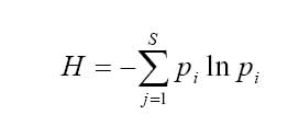
Our first thought was to measure the entropy (randomness) of detections in an incident, which led us to diversity and mathematical ecology. This approach failed, but led us to something better.
Adopting ecological metrics: Fitting a square peg into a round hole
Mathematical ecology brought us to the Shannon Diversity Index, which measures population diversity, and Hill Numbers, which measures the number of species if they were equally abundant.
Let’s compare the earlier incidents after using these equations with a logarithm’s base of two. You might come across equations using a different base logarithm, but in this case two is more common in information theory. You can use any base you want, it just needs to stay the same across data sets and be consistent.
These were the results:
| Incident name | Shannon Index | Hill Number |
|---|---|---|
|
Incident 1 |
1.58 | 2.99 |
|
Incident 2 |
0.817 | 1.76 |
|
Incident 3 |
1.58 | 2.99 |
You can quickly see the issue with this output: incidents one and three scored the same, and incident two was penalized. This was because it had a higher count of detection A. Even with the equal numbers for detection B and C, because detection A is higher and more likely to be picked at random, it got a lower value. This approach successfully identified proportion, but penalized imbalance. So much so, that the incident with more alerts and the same detection count scored worse.
And then there were two: Measuring more than just entropy
We can’t just look for maximum entropy (balanced diversity), and so we grappled with a way of measuring incident quality while still using diversity as a factor. We needed two measurements because maximum entropy alone isn’t a good indicator for quality, because it doesn’t consider total volume. We need to consider both proportions of the detections and their volume. Metric A asks, “Does this incident have enough detections for redundancy and to corroborate the evidence?” Metric B asks, “Does this incident rely too heavily on a single detection?”
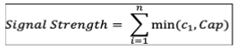
We’ll call metric A signal strength (the weight of the evidence); it led us to capped counts. Capped counts allowed us to give detections that fired more than once more weight, while avoiding counting all of them, or giving too much weight to a detection that triggered frequently by setting a default cap of three. The rationale for using a cap of three is that one occurrence is likely chance, two coincidence, and three a pattern.
Let’s look back to our incident examples to see how this breaks down:
| Incident name | Detection A | Detection B | Detection C | Total | Capped count |
|---|---|---|---|---|---|
|
Incident 1 |
1 | 1 | 1 | 3 | 3 |
|
Incident 2 |
10 | 1 | 1 | 12 | 5 |
|
Incident 3 |
4 | 4 | 4 | 12 | 9 |
Using a default cap does pose an issue. It assumes all incidents have the same scope of compromise. There’s a significant difference between an incident involving one compromised asset and one involving ten. The incident with more compromised assets has more impact and risk.
To account for this, if the evidence of compromised assets is accessible, we can create a dynamic cap by using the maximum count of internal assets involved in the incident. (We were able to break up incident data by source user or source IP, which we limited to internal IPs.) This way, the dynamic cap will adjust based on the scope of the incident, allowing for higher counts of alerts if more assets were compromised, and increasing the signal strength. If the count of compromised internal assets is unavailable, then the default cap is used.
This is the equation we used to calculate metric A (signal strength), with c1 being the raw alert count for the given detection, and Cap being the calculated incident cap (default or dynamic):
If you’re using the default cap, and have an incident with a detection count of 100, one, and one, that would look the same as an incident with a detection count of ten, one, and one. This is where metric B comes in. While metric A measures the signal strength of an incident, metric B measures the loudest detection in an incident.
Metric B, which we’ll call the dominance ratio, uses the Berger-Parker Index, another method used in ecology to measure diversity. The equation for this index calculates the proportional abundance for the subject with the most abundance. In this equation, Nmax is the alert count of the detection with the most alerts, and N is the total count of alerts in the incident:
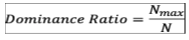
If we go back to our incident with a detection count of ten, one, and one, the dominance ratio for this would be 0.83, while the dominance ratio of 100, one, and one is 0.98. So while these two incidents could have the same signal strength, the dominance score for the second is higher, and even more over-reliant on a single detection.
Painting a picture: From data to visualization
Now that we have two meaningful measurements, let’s see them on a graph. Visualizing the date makes it easier to understand and see trends.
The y-axis measures the dominance ratio (metric B) and the x-axis is the signal strength (metric A). The size of the plot point represents the total count of alerts in the incident, which can help differentiate a near-miss incident and a loud one.
To make reading and visualizing this graph easier, we created a gradient from the top left to the bottom right shifting quality from fragile -> risky -> decent -> robust. We’ll also split the graph into four quadrants: quiet, unstable, noisy, and ideal as zones. Here’s how we’re defining these:
Gradients
- Fragile: Incident can disappear if the detection breaks
- Risky: One or two steps away from missing the incident
- Decent: Healthy, but can benefit from detection improvements over time
- Robust: Quality incident that paints a clear picture of the attacker’s actions
Quadrants
- Quiet: Incidents with low signal, even if the dominance is balanced
- Unstable: Incidents with high dominance and low signal
- Noisy: Incidents with high dominance and high signal
- Ideal: Incidents with low dominance and high signal
Here are the ranges we chose to use for each gradient:
| Gradient | Fragile | Risky | Decent | Robust |
|---|---|---|---|---|
|
Range |
Dom ≥ 0.9
OR Signal ≤ 2 |
Dom 0.6–0.89
OR Signal 3–4 |
Dom 0.4–0.59
OR Signal 5–6 |
Dom < 0.4
OR Signal ≥ 7 |
The top and left edge of the graph represent the most fragile incidents, since both edges indicate dependence on a single detection. As signal strength grows, the dominance ratio will generally curve down.
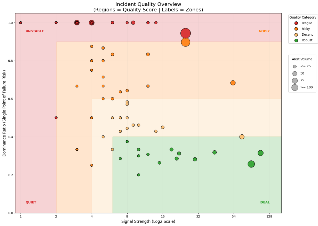
Starting along the top and left edge, this area represents fragile incidents. These incidents have high dominance or low signal, meaning these incidents rely completely or heavily on a single detection. These incidents might seem safe from a volume perspective, due to the one detection doing the heavy lifting. If something goes wrong with that one detection, the incident is at risk of being missed. Incidents with a single detection will end up here.
Moving inward to the bottom right, the next level is risky. This level is for incidents that won’t be missed if that single detection breaks, but if it does, you still might miss them since the incident is still primarily dependent on that one detection, (meaning the signal strength is still low). If you’re using the dynamic cap, those incidents are more likely show up here, resulting in a mixed bag of incidents and their detection proportions and leading to a wider range for this gradient level.
The next gradient level is decent. These incidents are healthy, and while they don’t need immediate improvement, there’s still potential for tuning over time.
The last level is robust. Incidents here are solid, and the detections alone likely paint a clear picture of the attack lifecycle or threat actor’s actions.
By creating quadrants using thresholds, we can further define the state of the incident within a gradient. By splitting the graph with two lines—one along the dominance ratio at 0.5 (or 50%) and the other along the signal strength at six—we can get even more granularity. Any incident with half or more of the alerts coming from a single detection is unstable and risky, due to over reliance on that detection. An incident with a signal strength of six or more tells us we have at least two distinct detections with three or more alerts of each (or equivalent). Anything over six has a strong signal.
These two lines split the graph into four zones. Starting at the bottom left and going clockwise, it reads: quiet, unstable, noisy, and ideal. In the quiet zone, the signal is low, even if the dominance is balanced. These are inherently fragile due to volume. In the unstable zone, these incidents have high dominance and low signal, meaning these incidents rely completely or heavily on a single detection. The noisy zone has incidents with high dominance and high signal. While it’s good that they have high signal strength (often due to dynamic capping of a detection involving a lot of assets), a single detection is the main contributor to the signal, resulting in a still fragile or risky incident. In the ideal zone are your low dominance and high variety signals from asset evidence or detections.
These are of course adjustable, and can be moved to better fit the needs of your environment. Additional gradients can be added to track more granular changes and progress depending on the environment and state of detections.
Progress takes time: Seeing the change
The next question is,“How do we measure change and progress over time?”
If your organization has been developing a lot of new detections and making changes to existing ones, in theory you should be able to see if these are supporting other detection in incidents, or becoming standalone incidents. You should be able to see if there was an observable trend of incidents becoming more “diverse” with alerts, increasing their signal strength and bringing the dominance ratio down.
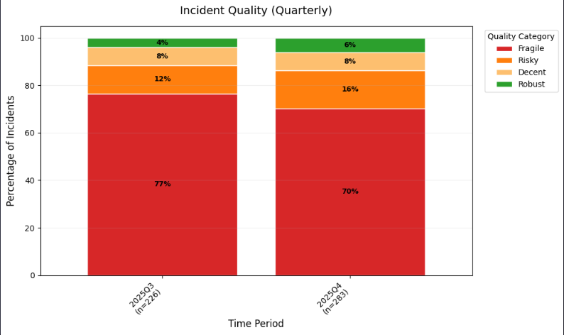
For this we can use a 100% stacked bar chart. The bar chart is grouped by gradient level, and each chart separated by annual quarter. This shows the percentage change of incidents in each gradient level per quarter. Ideally, fragile incidents get smaller as the robust incidents get bigger.
Things to keep in mind
There are some caveats with this approach. It doesn’t consider severity, so if you have an incident with a single detection but it’s a critical severity that you know is carefully managed—triaged quickly and with scrutiny—that may be sufficient.
Incidents caught at the initial access tactic stage are likely to have less activity, since it’s so early in the attack lifecycle, and there are fewer opportunities and indicators to detect. You may have the option to filter on these before calculating, and if not, it’s worth keeping in mind.
The dynamic capping may be more challenging depending on how available the evidence is to you. Using it is also more likely to result in an incident moving from unstable to noisy, because while the signal strength went up due to the higher cap, the dominance ratio stayed the same. This isn’t necessarily bad, just riskier due to the reliance on the one detection.
Our goal was to drill into the incidents and find what separated a strong incident from one that was at risk of being missed. By knowing the difference, those risky incidents can hopefully be improved, driving detection strategy improvements, and making your organization as a whole more secure and resilient.

")

